Master SurfPal: A Deep Dive into Website Usage Analytics
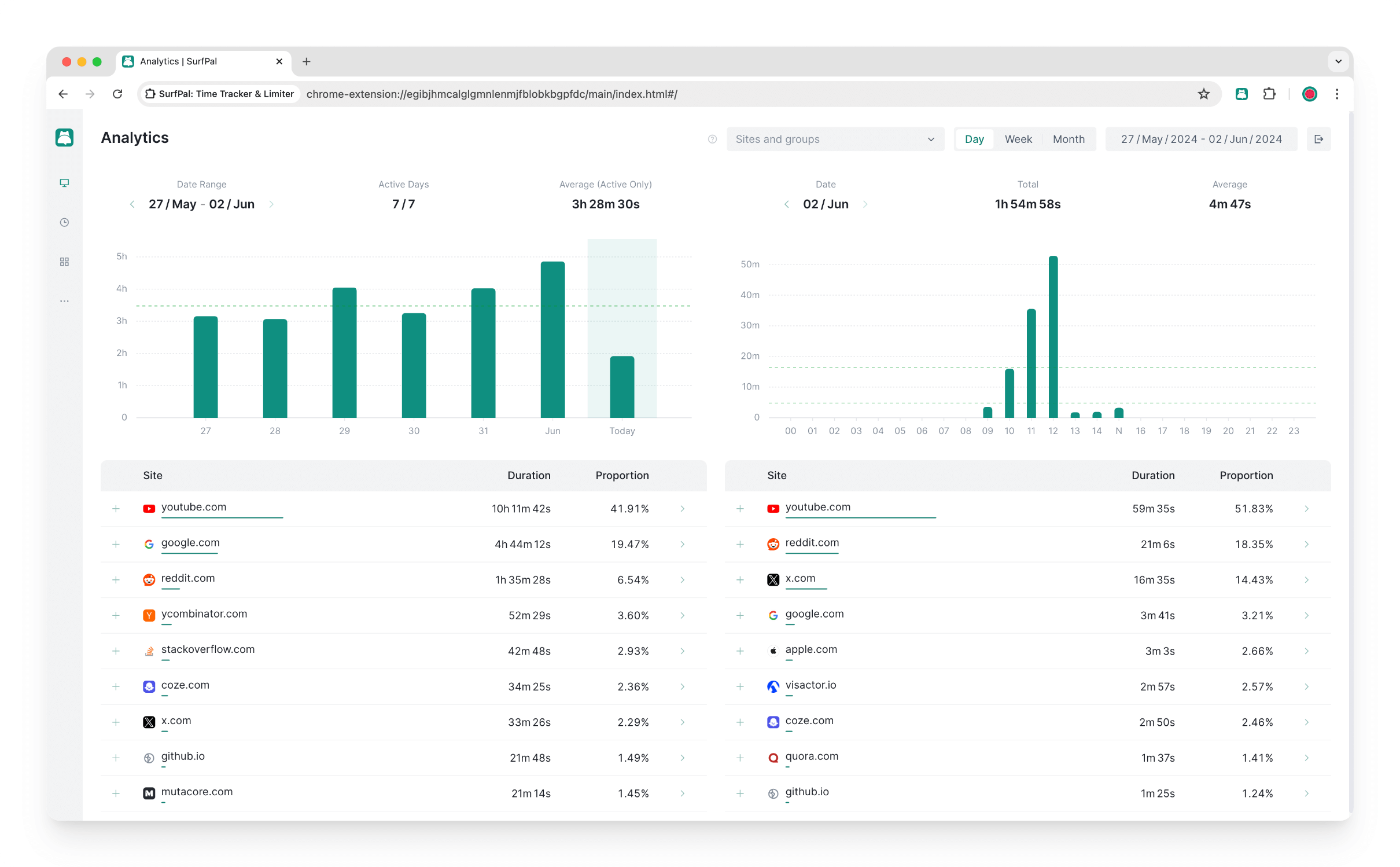
One of SurfPal’s core features is its intuitive and powerful website usage analytics. To help you maximize your productivity with SurfPal, this article will detail how to use SurfPal’s data analysis feature to understand your online habits.
As the image above shows, the Analytics page is composed of a control area at the top and a data display area at the bottom. The data display area is divided into two parts, with the left showing the data for the queried time range and the right showing the drilled-down data.
Let’s start with the control area. Here, you can adjust the collection of websites or groups to query, the granularity, and the time range.
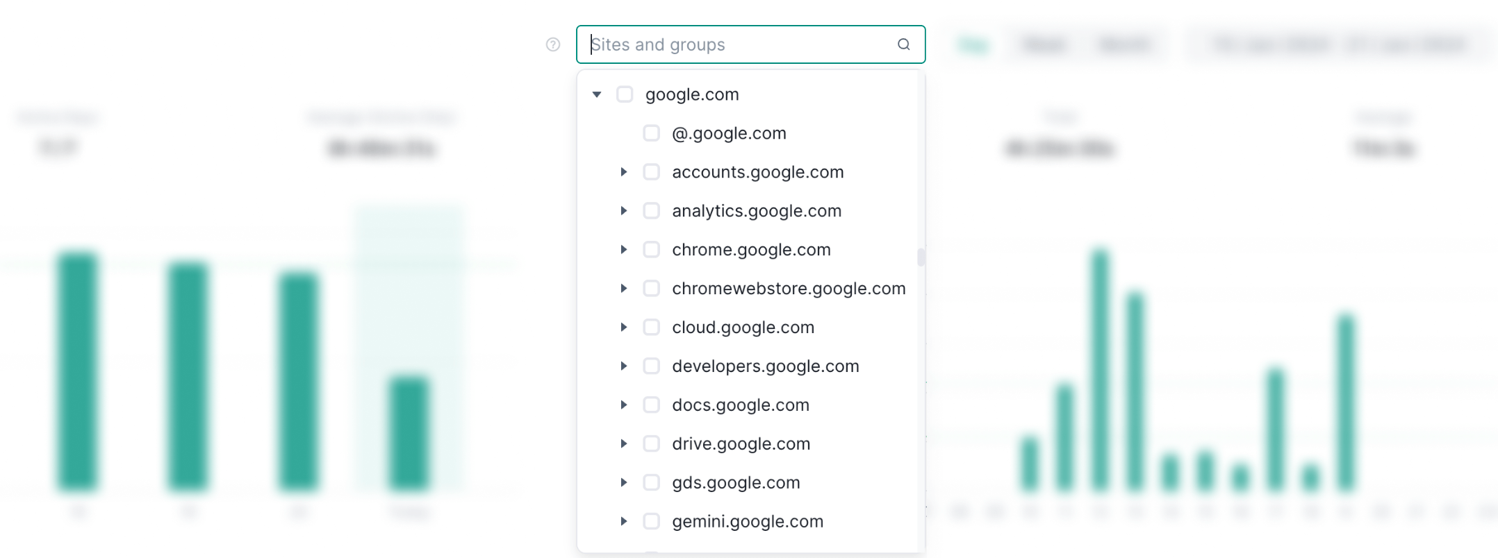
Both websites and groups support multi-selection, and you can select any level of domain. For example, you can select google.com, which means you query the data for google.com and all its subdomains, or you can select @.google.com, which means you only query the data for the domain google.com itself, excluding its subdomains.
The query granularity can be set to day, week, or month. When you choose day as the granularity, the drilled-down data will be displayed in hours. When you choose week or month as the granularity, the drilled-down data will be displayed in days.
All query parameters are bound to the URL’s query string, different query parameters will have different URLs, and you can bookmark interesting Analytics pages like any other webpage, without having to repeatedly adjust the query parameters.
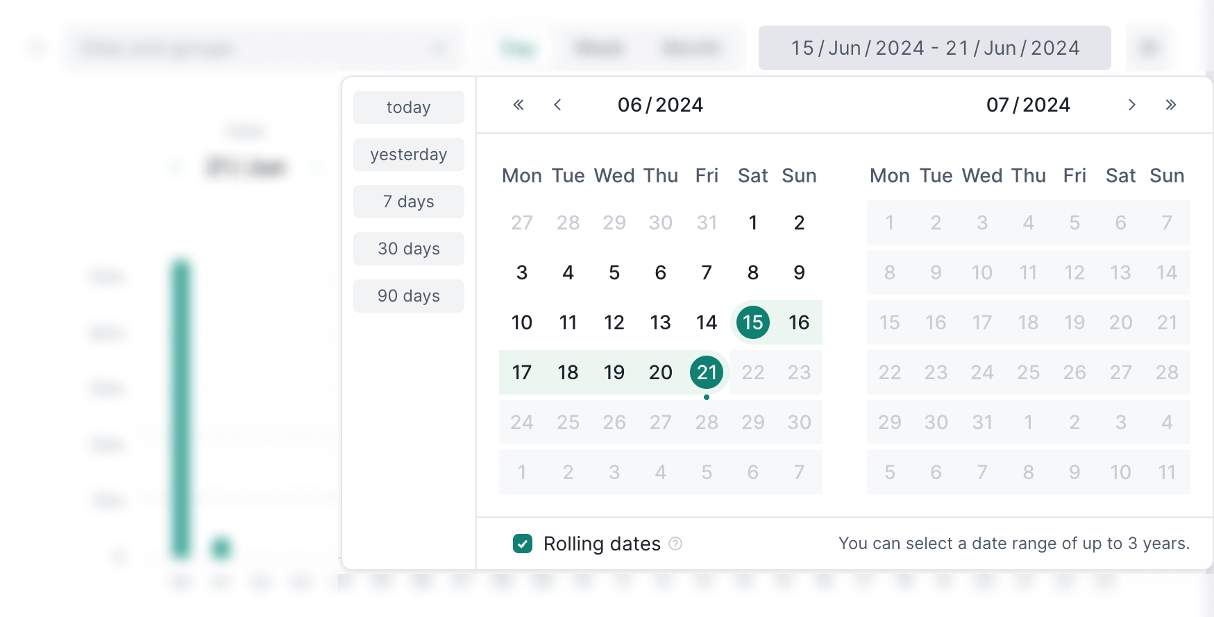
Before bookmarking the Analytics page, you can use the “Rolling dates” option in the time range selection panel to set whether the time range uses absolute or relative time.
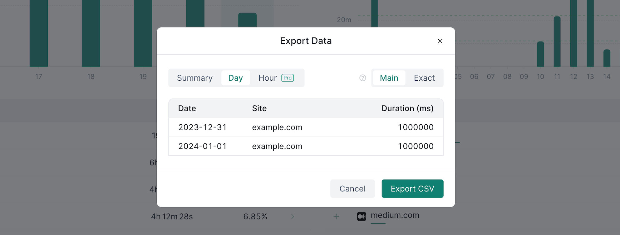
SurfPal supports exporting your screen time data in CSV format for easy processing in other software. Clicking the button on the far right of the control area will open the data export dialog box, where you can choose the data aggregation granularity you want from multiple options.
Next is the data display area, from top to bottom are the aggregated data, time series bar chart, and leaderboard.
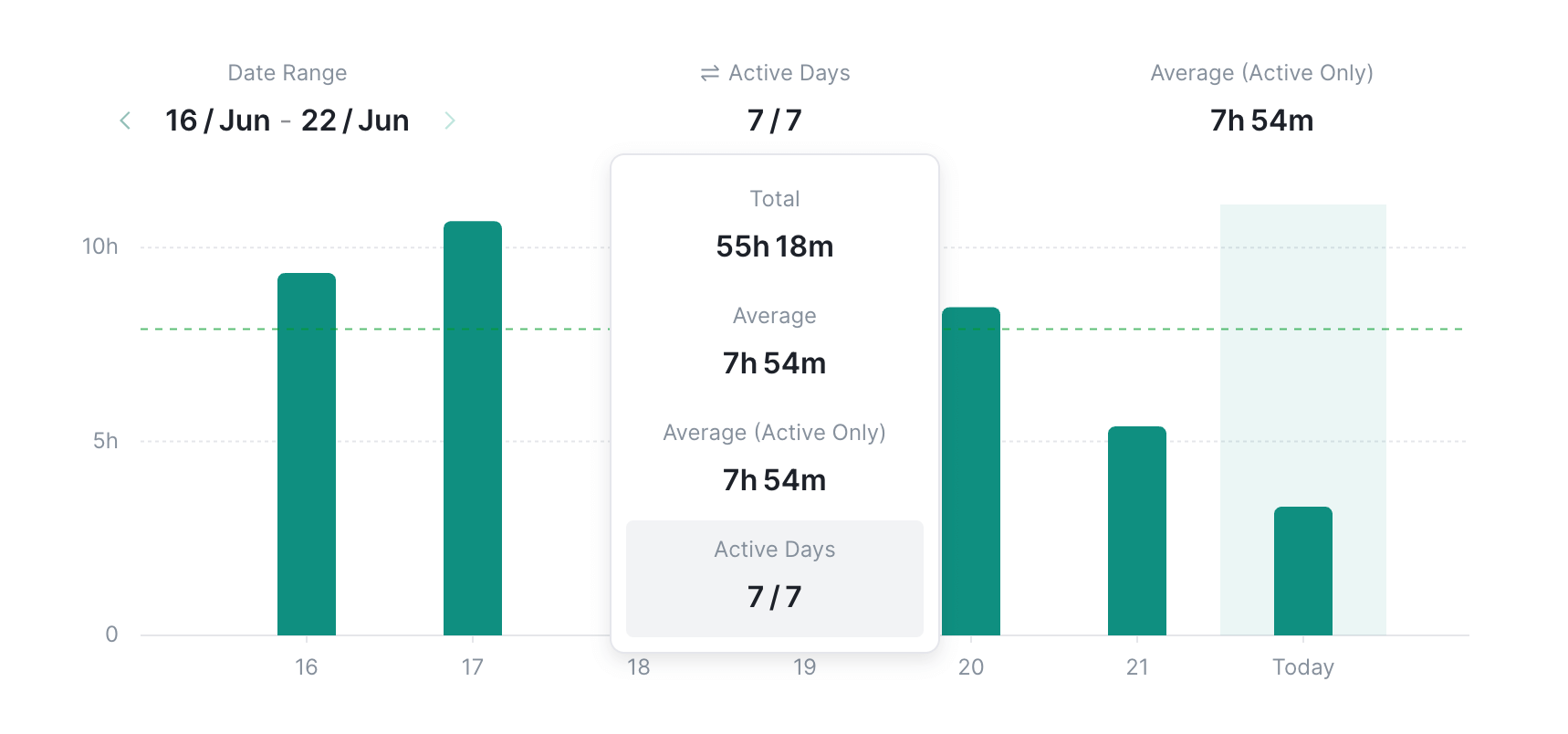
Each block of aggregated data can be adjusted, just click on the block with the mouse, and select the data you want to display from the dropdown list.

In the time series bar chart, there are two green dashed lines, the lower green dashed lines show the average duration. The higher green dashed lines, on the other hand, represent the average duration but only for active periods.

In the leaderboard, you can view the data of any level of domain. Clicking the button on the right will open the Analytics page for this domain.
👉 Get SurfPal: Limit Screen Time · Block Website · Stay Focused